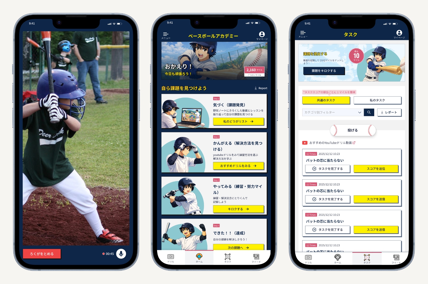
01 — The Problem
The academy had no formal system connecting coaching to daily player practice.
Drills were recorded and uploaded to YouTube, instructions were given — but once a session ended, there was no structured way for players to know what to work on, track whether they were improving, or revisit what they had been taught. Progress was hard to measure. Consistency was hard to maintain.
The brief: build a platform that creates that structure — a direct line from coaching content to daily player practice, without adding operational burden to the coaches delivering it.
Before any visual decisions were made, the focus was entirely on flow logic. The wireframes existed to pressure-test one question: could a player navigate from joining the academy to completing their first task without anyone explaining what to do next? Every screen at this stage was treated as a hypothesis. Does this step need to exist? Does it belong here, or somewhere else in the sequence?
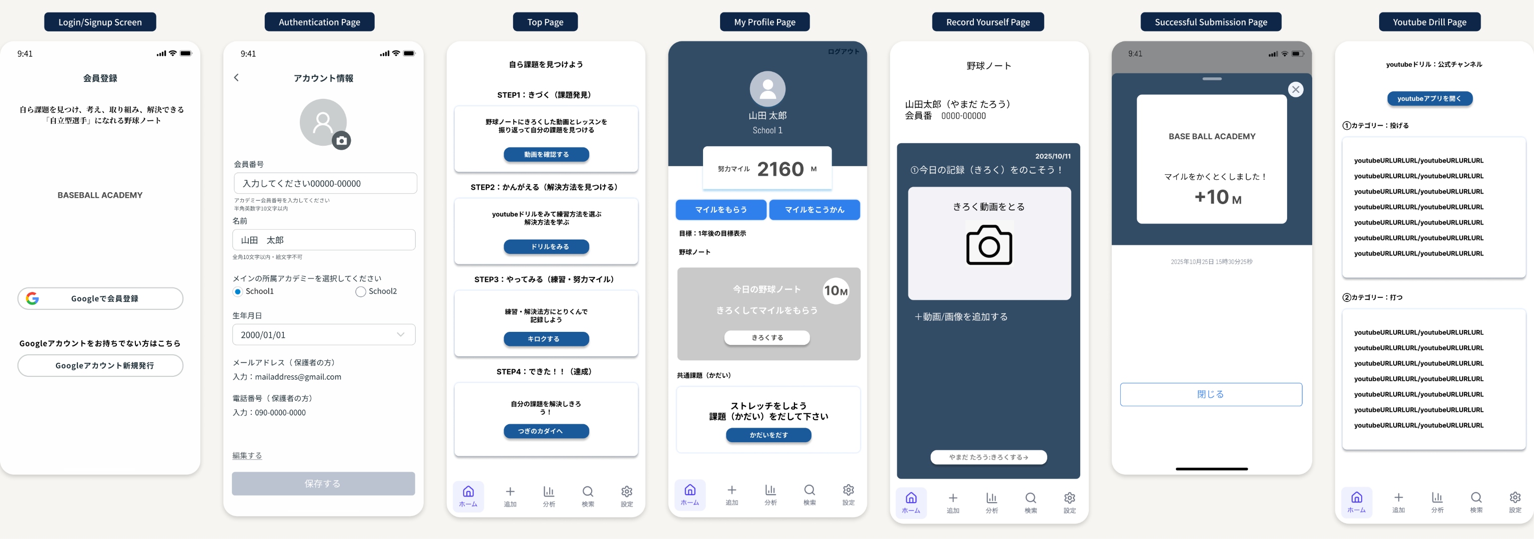
Early wireframes, pre-visual. Seven screens covering the full player flow: registration, account setup, the 4-step task loop, home with Miles balance, the baseball note recording screen, and the YouTube drill channel. Each screen was treated as a hypothesis — kept only if it answered a navigation question the previous screen couldn't.
02 — Who This Was Designed For
Japanese baseball students, ages 12–17.
Mobile and tablet (iOS/Android), in a structured academy setting — coaches, admins, and players with clearly defined roles. Two personas shaped the product from the start.
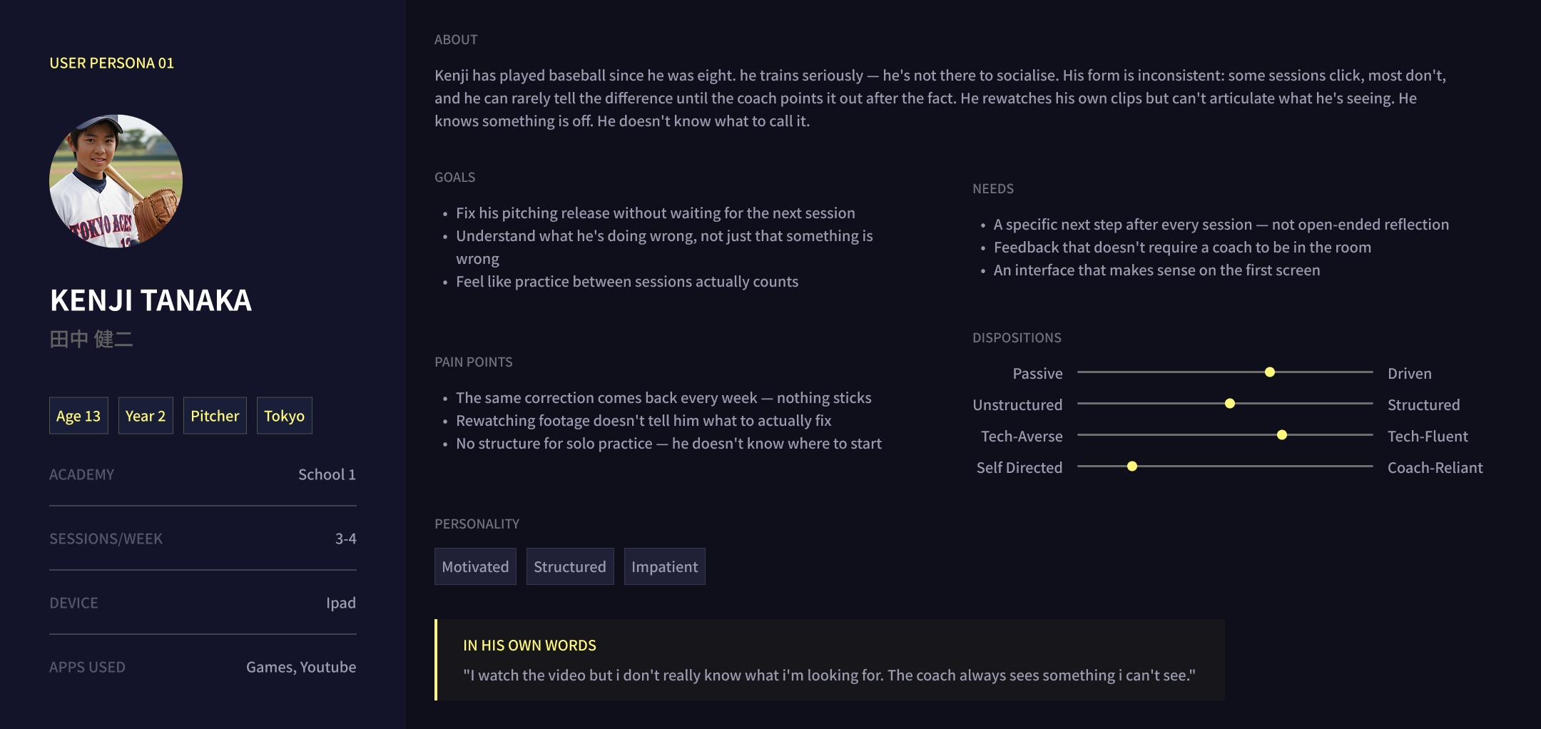
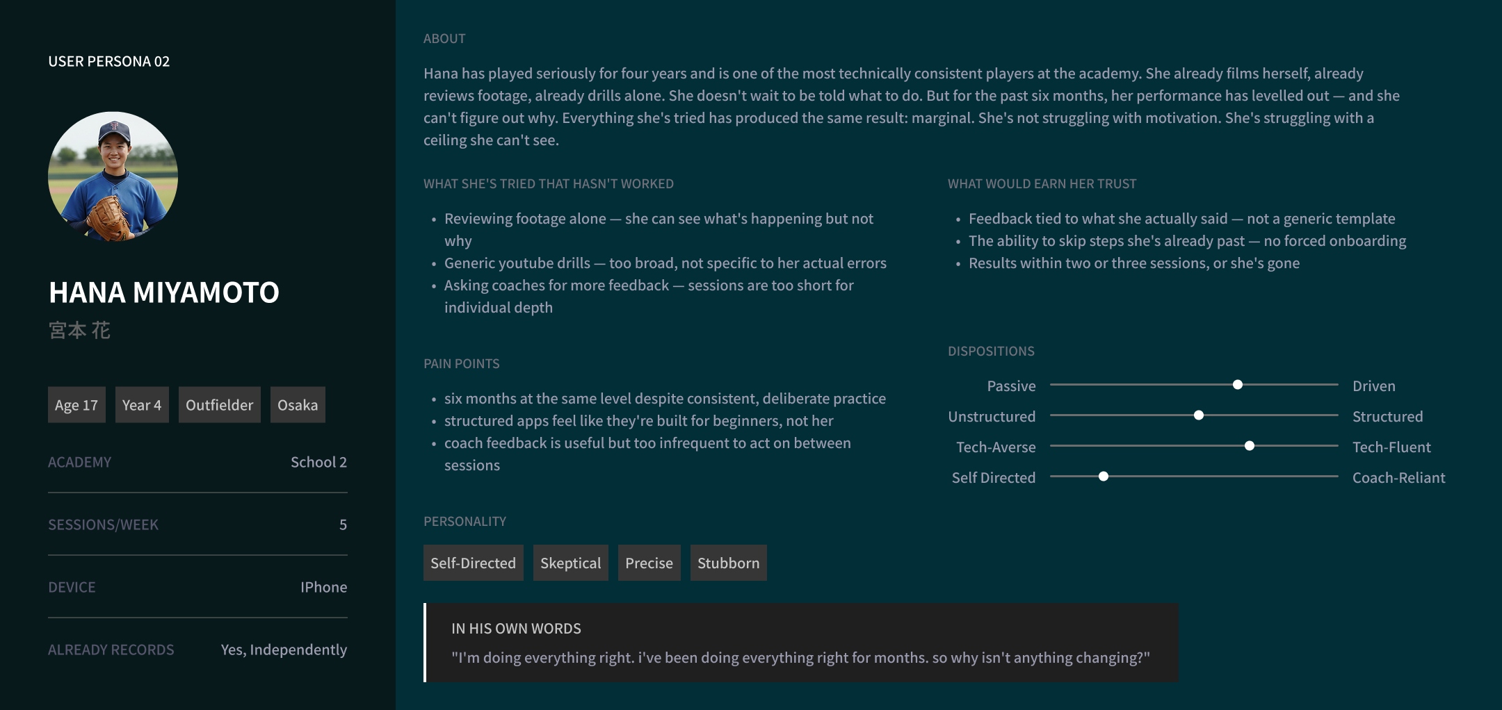
Kenji knows something is off but can't name it. Hana is already doing everything right — and still not improving. Different problems, same gap: no structured feedback between sessions.
03 — The Core Insight
Say what's wrong. The system does the rest.
"Players are good at practicing. They're bad at diagnosing."
The shift that defined the product
You can repeat a drill a hundred times and never name what you're actually doing wrong — and without naming it, nothing changes. When a player records a session, they speak aloud about what they're struggling with. That voice is transcribed, analyzed by AI, and used to assign specific practice tasks. Based on what the player said, not assumptions from footage.
04 — Key Design Decisions
The choices that shaped the experience.
Not a tour of every screen — the decisions worth explaining.
Decision 01
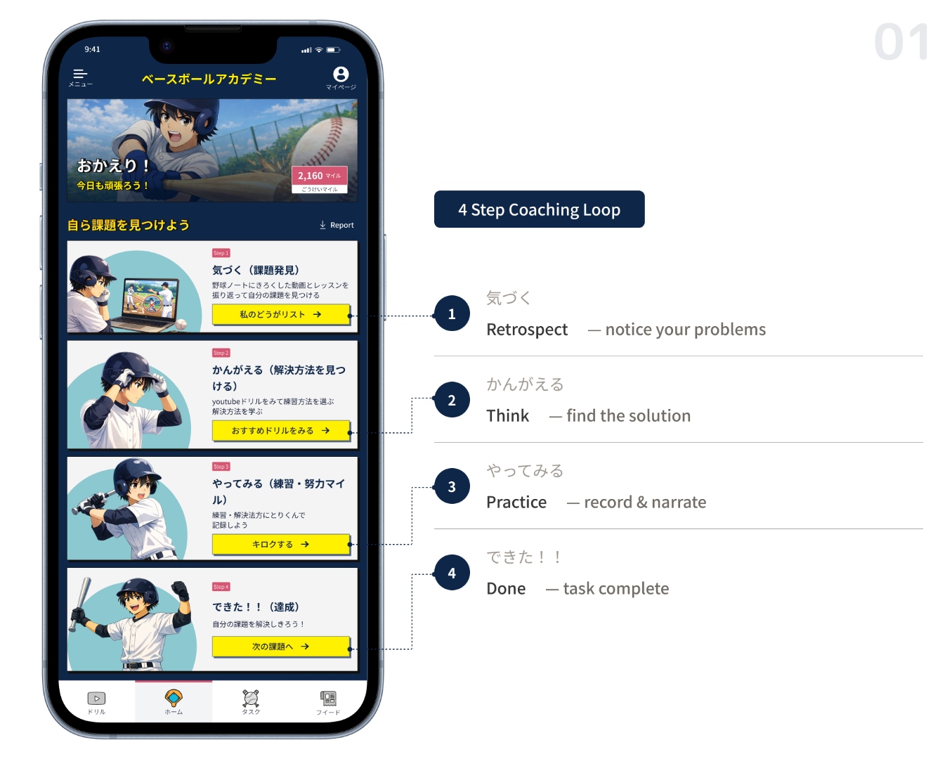
Home screen as sequential flow, not feature dashboard
Most apps organize by feature category: videos here, tasks there, progress over here. That asks users to construct their own mental model of what to do next. Instead, the home screen is a single vertical flow that mirrors the 4-step coaching loop. Open the app — see exactly what step comes next. No decision fatigue.
Cards are tall, so smaller devices scroll further to reach step 4. That was a deliberate trade: clarity over compactness.
Decision 02
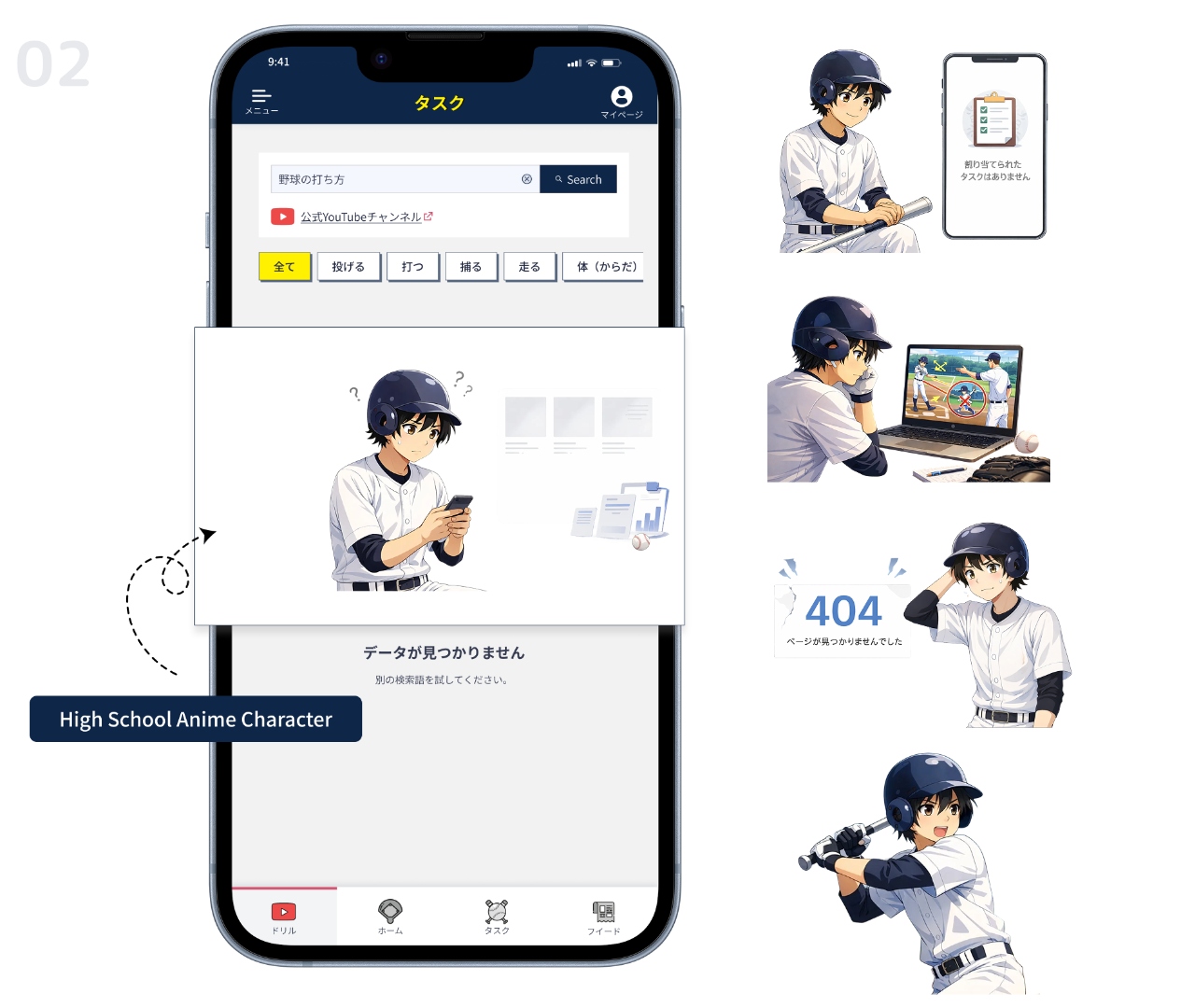
Anime character anchored toward the older end of the age range
The app needed to work for both 12-year-olds and 17-year-olds simultaneously. Anime was the right visual language — genuinely cross-generational in Japan. But character age required deliberate calibration.
Younger students aspire upward and accept older-looking characters. Older students disengage from characters that look too young. Anchoring toward the older end served the full range with one visual decision.
Decision 03
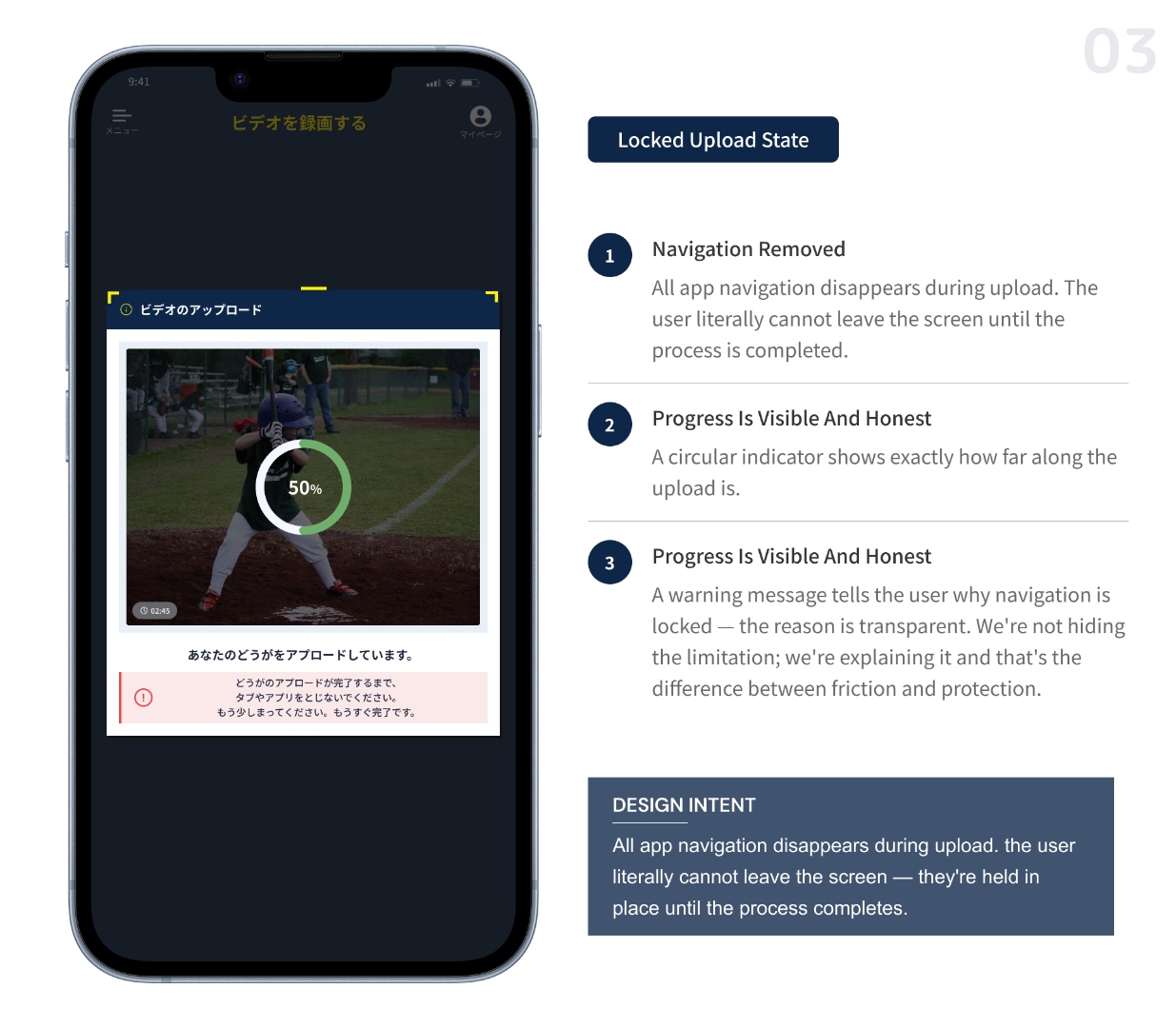
Locked upload state to protect the pipeline
When a player submits a recording, two things happen in parallel: the video uploads and the voice transcript is sent for AI analysis. If the app closes mid-process, the transcript is lost — no task extraction, no progress logged, no Miles earned.
The interface locks completely during upload. Navigation disappears. A message explains why. The constraint isn't punishing — it's protecting the work the player just did.
Decision 04
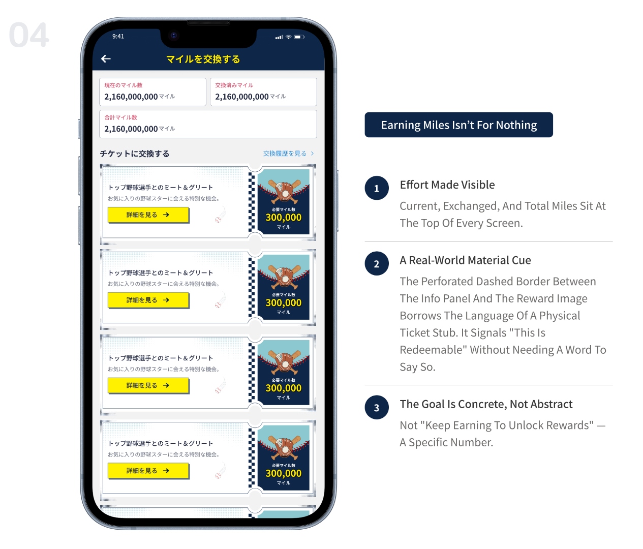
Effort earns currency. Currency earns access.
Every task a player submits earns Miles — visible in the app and exchangeable for a meet-and-greet with a top professional. The exchange screen makes the reward concrete: you can see exactly how far away you are.
Submit → earn → see progress → exchange → repeat. The reward isn't abstract points. It's an experience only a baseball player would care about — which is exactly the point.
06 — Reflection
What landed. What I'd redo.
What Landed
The automated pipeline reduced coach workload — one upload, tasks distributed to all players
The Common Tasks / My Tasks split gave players clarity on what was expected vs. what was personal
The locked upload state protected data integrity without significant user pushback
What I'd Redo
The Miles earning moment is functional but flat — it should feel like a milestone, not a background update
The home screen cards are tall on smaller devices — a more compact layout would scale better
AI task suggestions when transcription is ambiguous need clearer UI — players and admins need confidence in what was auto-generated vs. confirmed